Monday, July 27, 2015

Using photographs on cards

I love stamping, and I love stamps.  I enjoy the creative possibilities in stamps.  You wouldn't think there was much creative opportunity -- after all, it's the same image, over and over. But the image changes with colours used, how it's used and in what scenes you build on your cards.  It never fails to thrill me.

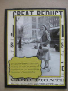
But I also use photographs from magazines on card fronts.  I generally scan the photographs first, in case I want to use them again in collages.  Because of copyright implications, I would never submit these cards to a magazine. Instead, I sent them to my sister as a mailbox surprise!

Except for the photos, these are all SU products, long discontinued (miss you, Summer Starfruit).


Friday, July 24, 2015

Have you discovered foiling?

Jennifer McGuire is a technique queen who has been in the card making business for quite a while, now.  She has an engineering background (like me), and has a very precise and scientific way of putting together her cards.  I just love it when she gets out her T-square to line up card elements!

Perhaps a month or so ago, she demonstrated techniques using foil.  Christine and I were all over it! We fired up the laminator, and here's what we made:


The foil was applied with two-sided adhesive paper die cut in the shape of the butterfly.  I over-stamped it with the dictionary background stamp in Crumb Cake, rubbed with a bit of Pool Party, added coffee splotches (Kaisercraft) and sentiment (Stampabilities).


Another die cut.  Post-it tape is invaluable for keeping the die in shape while you peel the backing off. I overstamped the starburst image in Daffodil Delight.  The stars were punched from a sheet of sequin plastic.


A stamped image needs Versamark, clear embossing powder and a laminator.  stamp, emboss, and then run the image through the laminator with the foil on top.  The embossing melts to the foil.  This give the best image of the methods we tried. The sentiment was embossed with silver embossing powder.  I didn't have any silver paper, so I swiped the edges of some Whisper White with Versamark, and heat embossed with silver. A bit of sheer Cherry Cobbler ribbon looks like it is tied around the stem.

Thursday, July 23, 2015

The great thing about summer vacation is it gives me time to CLEAN!!  Yesterday, we tackled the closet that holds all of our water "stuff" - water softener, iron filter, UV light, pump...We now have three piles to be dealt with: garbage, Value Village and ReStore.  That's today's mission!

Cleaning my desk of random supplies can be just as rewarding. These three cards are part of a set that I donated to Louise's hospital. They all use DSP, scraps of ribbon, and bits of string that have been cluttering up my work area, but are "too good" to throw away! Some of the supplies are SU, but most of the paper is from a prize pack of selected papers that I won at a Scrapbooking for Literacy event in March.


Wednesday, July 15, 2015

It feels good to be back

Well, it's been a while since I've posted.  I even wondered if I would again.  My mother died two years ago, and it seemed that it wasn't my mojo that left me - it was the feeling that I was making worthwhile use of my time.  Making greeting cards seemed so pointless.  And all my crafty "stuff" would end up at the curb in green garbage bags when I die, just as my mother's treasures did.  So I didn't do anything.  And I avoided my craft room.  It got taken over by the papers of my parents' estate.

But everything has cleared.  Accounts are paid out, property dispersed or donated, and Mum and Dad's papers have been reduced to a file folder and a box of old tax returns.  And my craft room looks like a craft room again.  Still messy, but this time with paper and glitter and ink.

What helped was getting together with some work chums to make cards.  I designed 4 cards to make, and a group of 5 or 6 women would stay after school and make the cards.  Having the commitment of 4 cards made me design and play.  Won't lie - the first few cards were totally CASEd from Pinterest. I didn't have an original thought in my head.  But, then, inspiration started returning.

I have a bunch of cards to show you, but I'll start off slow with these 3.

I used a Heidi Swapp stencil on all three.  I sprayed with Perfect Pearls mist, over stamped, used other stencils, and paper pieced.  They lay unfinished on my desk for a long time, which means that I have probably overworked them, as every time I saw them, I did something else to them.  Poor things!


Wednesday, July 24, 2013

New In Colours

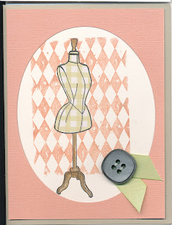
Stampin' Up has gone all pastel with the new 5 in-colours.  I had a big pout with the recent colour revision, as they got rid of MANY of my favourites.  The replacements aren't making me happy, but I am trying to work with them none the less.  Here is a card using 3 of them: Crisp Cantaloupe, Pistachio Pudding and Burnt Brown Sugar.  While I was in the UK, I picked up a magazine, Simply Handmade, which came with a set of stamps.  The dressform stamp comes from that set, as does the pistachio gingham paper used to spotlight the dressform body.  The argyle background is a Tim Holtz.  The ribbon is a scrap of Certainly Celery, which is far enough away from the Pistachio to look related.  This is an uncharacteristically clean card for me.


We had a lot of retirements at school this year, and this card is one that I made for a retiring VP.  It uses a technique that I learned from another UK magazine, PaperCrafting.  It involves outlining the stamped image with a really soft black pencil or charcoal.  It gives a shadow to the image, and really makes it pop.  The stamps are all SU: Everything Eleanor, Papaya Collage and You're a Gem.  Colours are Pool Party, Crumb Cake and Early Espresso.  I spritzed the card first with water and lightly dragged a sponge loaded with Crumb Cake into the water droplets to give the background some texture.  A single line of embossed cross stitches gives the edge some definition.


Thanks for looking!

Saturday, May 4, 2013

Published In the Catch Up Issue!

You may remember that I posted all of my bottle cards that I was submitting to Stampers' Sampler.  Then, the issue came out, and....none of them were published :(  Darn!  Though, the ones that were picked were very fine.

Then, in my mailbox this week, was a complimentary issue of 400 More Ideas (formally known as the Catch Up Issue).  And three of my bottles are in there!!

So, the message is...submit your ideas!  You never know -- you can be published, too!

Sunday, March 24, 2013

Mojo Making

I love making cards and collages.  But like everyone, I get into slumps.  I don't like my stamps (ANY of them!!).  I don't like my inks!  And my forest-worth of paper....all garbage!!

So, I take a class in anything but card-making.  I try new techniques, I meet new people, and sometimes, I even make something I like :)

Yesterday, I was at Sandra Spanuolo's class. She's an amazing collage artist and painter who generously shares her secrets with students. I attended her classes when she lived in |Milton, but now that she's literally around the corner from me, I find I am attending more.  We did a sweet little bird house.

Now, Sandra warns us -- for a long time, it's going to look ugly.  Then it gets better.  You just have to keep working.  It was my day to be ugly yesterday.  I was sorely tempted at one point to gesso over the whole thing and start over.  I was surrounded by masterpieces!  (Note to self: sit elsewhere next time)  But, with her encouragement, I persevered, and here's the result!
The little ball of wool at the top is a nest, but I need to sew it together.  The verse is, "The woods would be quiet if no bird sang but the one that sang best." (Henry van Dyke)  It's happy and spring-y.  Time to put away my brown and saffron and pale teal palette, and go with pinks and yellows and greens, I think!